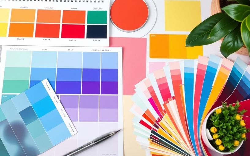
Color is one of the most powerful tools in a designer's arsenal. It can evoke emotions, influence behavior, and communicate messages without words. Understanding color psychology is essential for creating designs that truly connect with your audience.
The Science Behind Color Psychology
Color psychology is rooted in both biology and culture. Our brains are wired to respond to certain colors in specific ways, while cultural associations add layers of meaning. This combination creates powerful emotional responses that designers can leverage strategically.
How Colors Affect the Brain
When we see color, our brains process it in the limbic system, which controls emotions and memory. This immediate, subconscious response happens before rational thought, making color one of the fastest ways to communicate with your audience.
The Emotional Spectrum of Colors
Red: Energy and Passion
Red is the color of action, excitement, and urgency. It increases heart rate and creates a sense of immediacy. Use red for call-to-action buttons, sale announcements, or brands that want to convey energy and boldness.
Blue: Trust and Stability
Blue is associated with trust, reliability, and professionalism. It's the most popular color in corporate branding because it conveys competence and stability. Different shades evoke different feelings – navy suggests authority, while light blue feels calming.
Green: Growth and Harmony
Green represents nature, growth, and prosperity. It's associated with health, wealth, and environmental consciousness. Green is also the easiest color for the human eye to process, making it ideal for designs that need to feel balanced and restful.
Yellow: Optimism and Creativity
Yellow stimulates mental activity and generates feelings of happiness and optimism. However, it can also create anxiety if overused. Use yellow strategically to highlight important information or add warmth to your designs.
"Colors, like features, follow the changes of the emotions." – Pablo Picasso
Cultural Considerations in Color Choice
Color meanings vary significantly across cultures. While white represents purity in Western cultures, it symbolizes mourning in some Eastern cultures. Red is lucky in China but can signify danger in other contexts. Always consider your target audience's cultural background.
Global Color Associations
- Purple: Luxury and royalty in the West, mourning in Thailand
- Orange: Enthusiasm in America, sacred in Hinduism
- Black: Elegance in fashion, mourning in many cultures
- White: Purity in the West, death in some Asian cultures
Applying Color Psychology in Design
Effective use of color psychology requires understanding your brand's personality and your audience's expectations. The goal is to create emotional resonance that supports your message and drives desired actions.
Color Combinations and Harmony
Single colors rarely work in isolation. Color combinations create more complex emotional responses. Complementary colors create energy and contrast, while analogous colors feel harmonious and calming. Triadic schemes offer vibrant yet balanced palettes.
Context Matters
The same color can evoke different emotions depending on context. A bright red might feel exciting on a sports website but alarming on a healthcare site. Consider the industry, audience, and message when making color choices.
Testing and Measuring Color Impact
Don't rely solely on theory – test your color choices with real users. A/B testing different color schemes can reveal surprising insights about what resonates with your specific audience. Track metrics like engagement, conversion rates, and time spent on page to measure color effectiveness.
Ready to Harness Color Psychology?
Strategic color choices can transform your brand's impact and effectiveness. Let's work together to develop a color strategy that resonates with your audience and achieves your business goals.
Discuss Your Color Strategy